 |
|||||
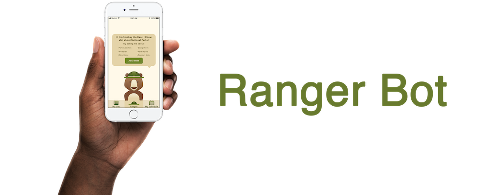
AI Powered Interaction Bot to Help Plan Your National Park Expedition |
|||||
|
|||||
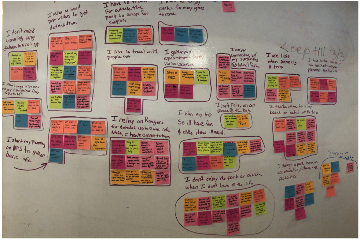
Challenge:We were challenged with designing a solution on an appropriate platform for a problem our team discovered within a certain topic area. Our team decided to focus and conduct research around National Parks in order to discover a problem users face. All decisions aside from the topic were made from research we conducted.Goal:Understanding the user in order to create a product on an appropriate platform that helps solve the user's needs in and around National Parks. After completing user interviews, our team decided to design a tool that would help users easily find information to plan a trip to a National Park.Phase 1: Research & SynthesizingWe created a screener survey to find users who had been to National Parks several times within the last two years. This would allow us to identify users who had experienced planning trips using tools and websites currently offered to the public. Our screener survey produced seven individuals for user interviews.After conducting user interviews, we affinity mapped the observations; and it was clear that most people struggled to find information easily and effectively. |
|||||
 |
|||||
Insights we found were:
|
|||||
 |
|||||
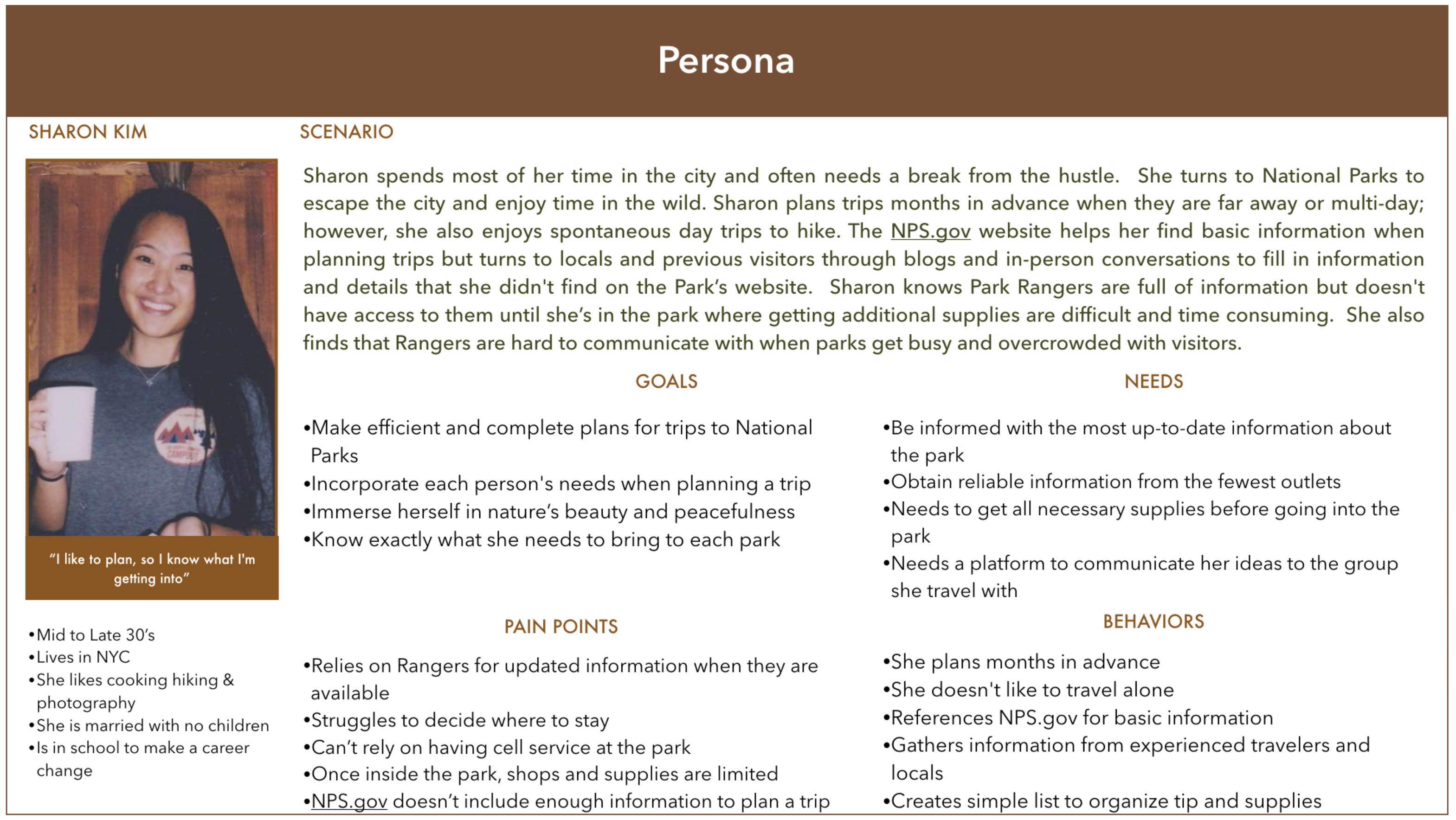
Taking into account the persona and all additional information we gathered from the user interviews, we were able to come up with the following problem statement:
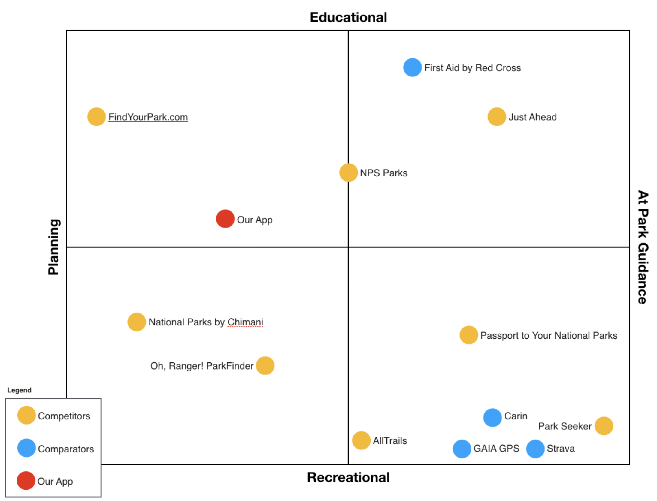
The National Park Service has a wealth of information on its website, but the information is hard to locate and doesn't include previous visitors' recommendations. Phase 2: Competitive Matrix, MoSCoW Map, Ideate, Proposed SolutionTo start solving our user"s problem, we began to assess what was currently being offered in the market. To accomplish this, we created a competitive matrix that included competitors as well as comparators. |
|||||
 |
|||||
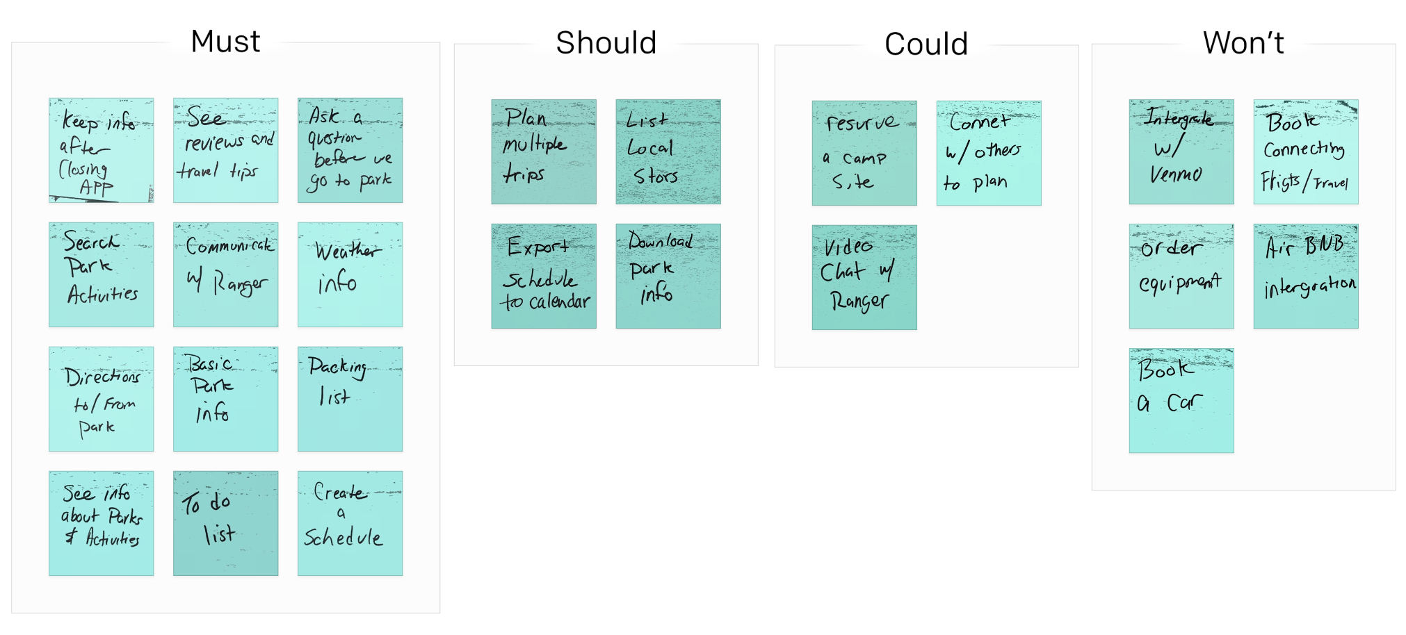
| Through the competitive matrix we saw an opportunity to create a product that would educate travels about the park as well as assist in planning their trip. Now that we knew where we wanted to position the product within the market, we needed to decide what features we wanted to include. We MoSCoW mapped with sticky notes on the wall to decide what fetchers needed to be prioritized. |
|||||
 |
|||||
With the features grouped by Must, Should, Could, and Won't; a pattern emerged. All the features we wanted to included fell within three categories:
|
|||||
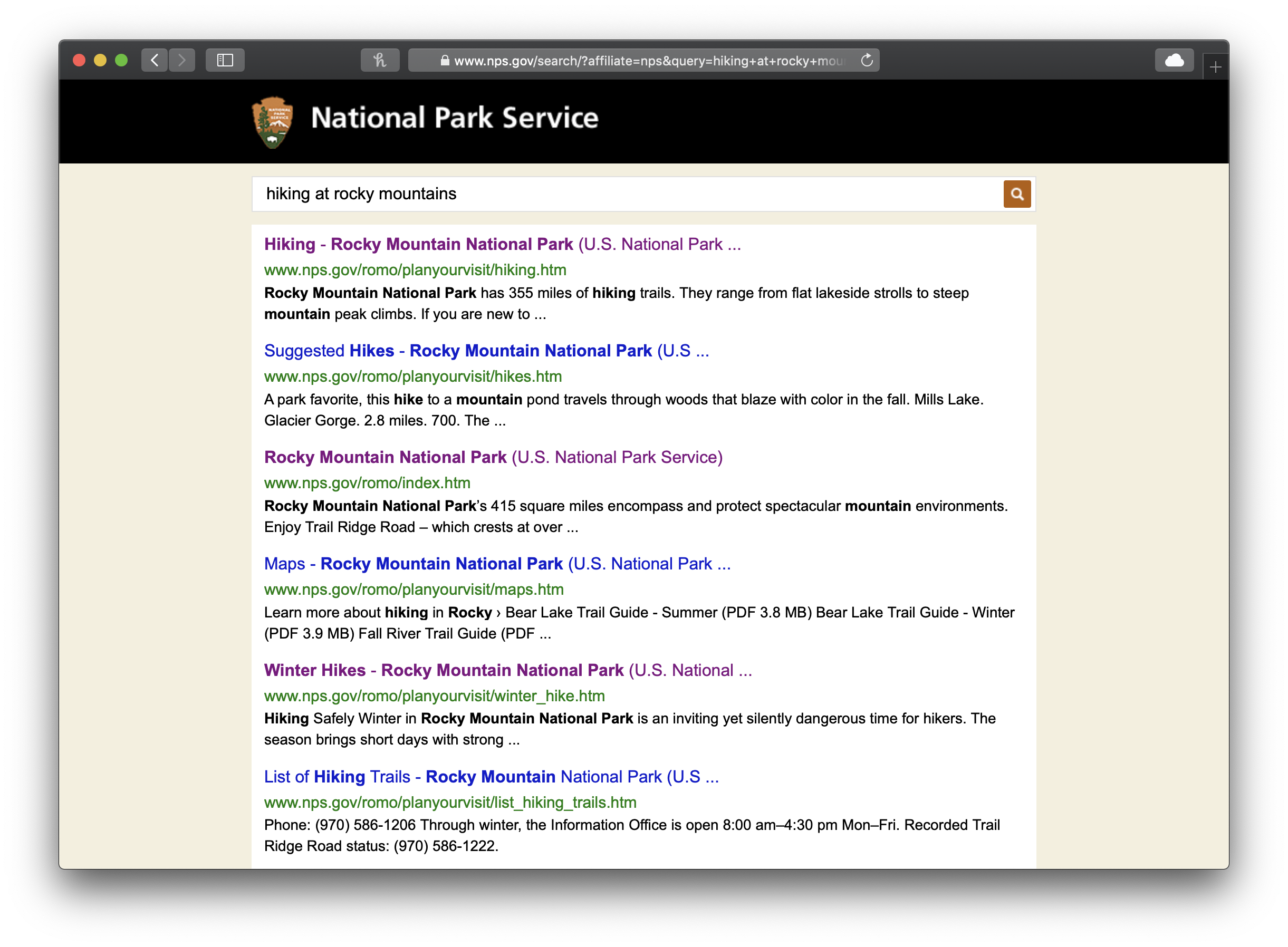
Phase 3: Ideate, Proposed SolutionKnowing that search was the foundation of the product, we needed to decide the best way a user could search for information. During user interviews, users shared their frustration with search engines."Using Google to look for this information is time consuming because I have to click on a result and then look throughout the page to find the information." User 1 |
|||||
 |
|||||
| NPS.gov search results for "hiking at rocky mountains" | |||||
We conducted a design studio and an idea that was generated was to use an interaction bot to help people search for information. Our user interviews told us that users enjoy talking to the Park Rangers because they have good information that is often updated. Users also responded positively about rangers because they had trust and confidence in them. By using the ranger as an interaction bot, we hoped it would help create the same trust and confidence for the users. |
|||||
 |
|||||
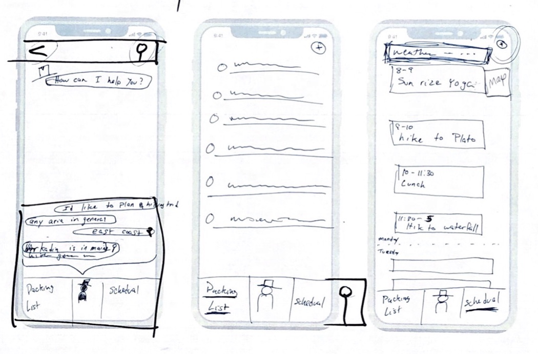
| Hand Drawn Chat Bot sketch from Design Studio | |||||
Other reasons we felt the interaction bot was a good idea were:
|
|||||
 |
|||||
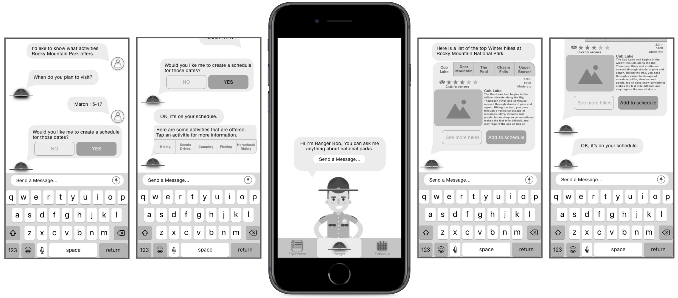
| Mid-Fi Sketch Prototype | |||||
Phase 4: Usability Testing Mid-Fi Prototype & IterateWith a the Mid-Fi prototype, our next step was to conduct usability tests on users. Again we found users through a screener survey confirming users had traveled to several National Parks within the last two years. We found two minor issues as we conducted our usability test. The reports are below: |
|||||
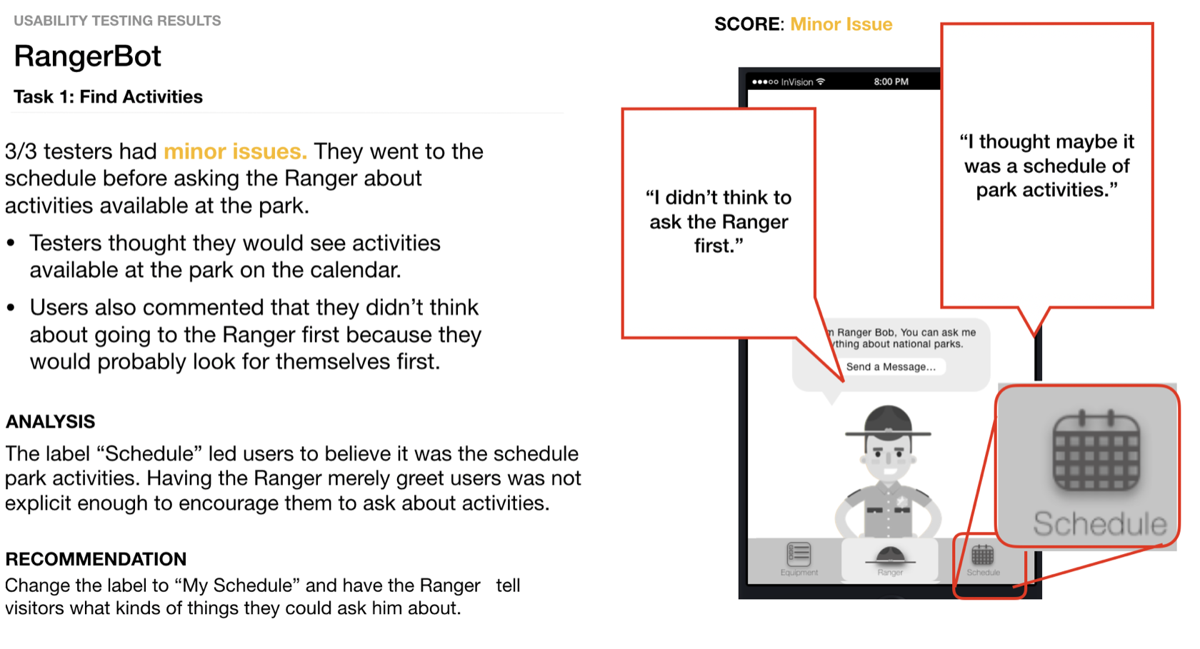 |
|||||
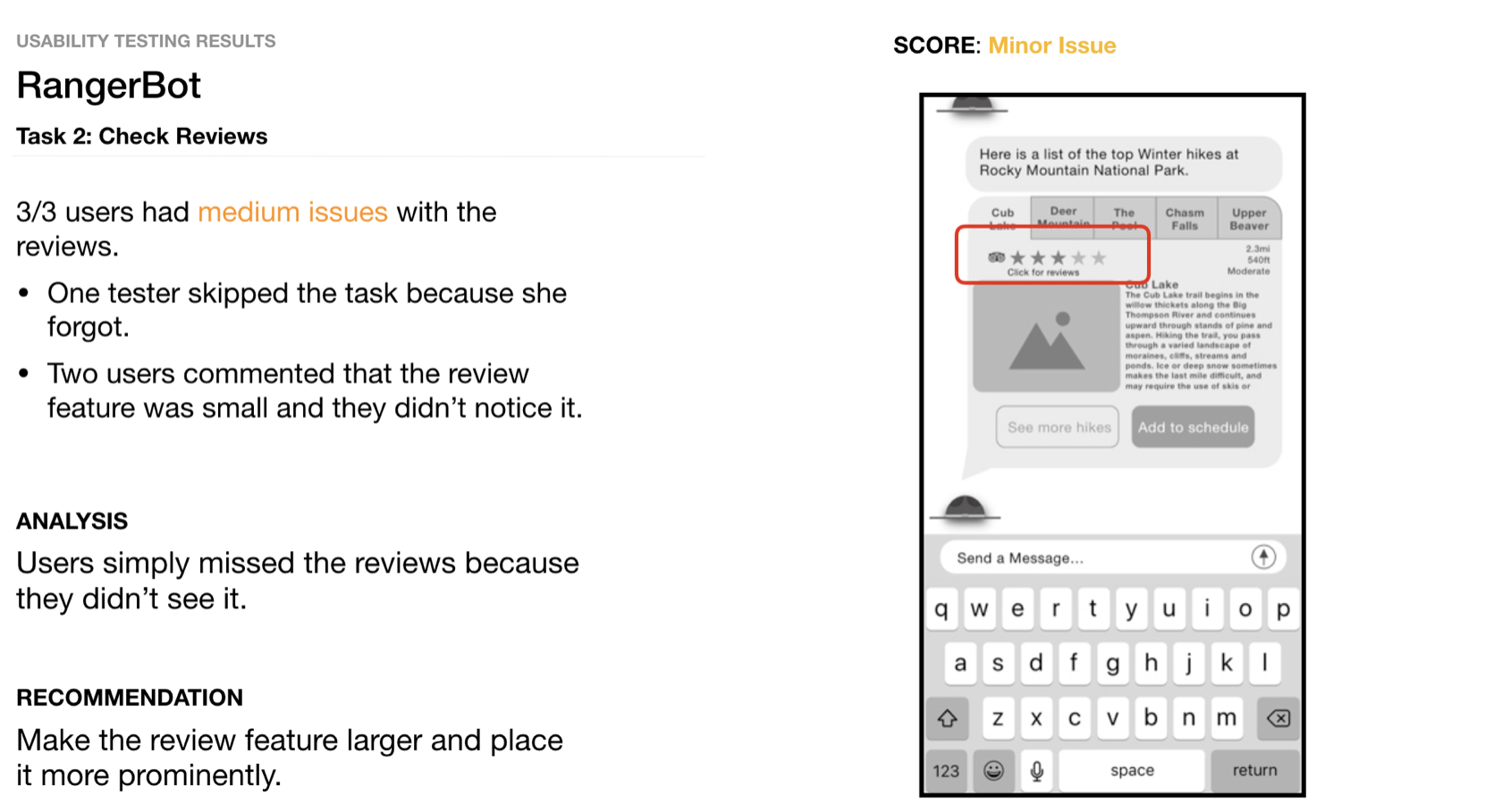 |
|||||
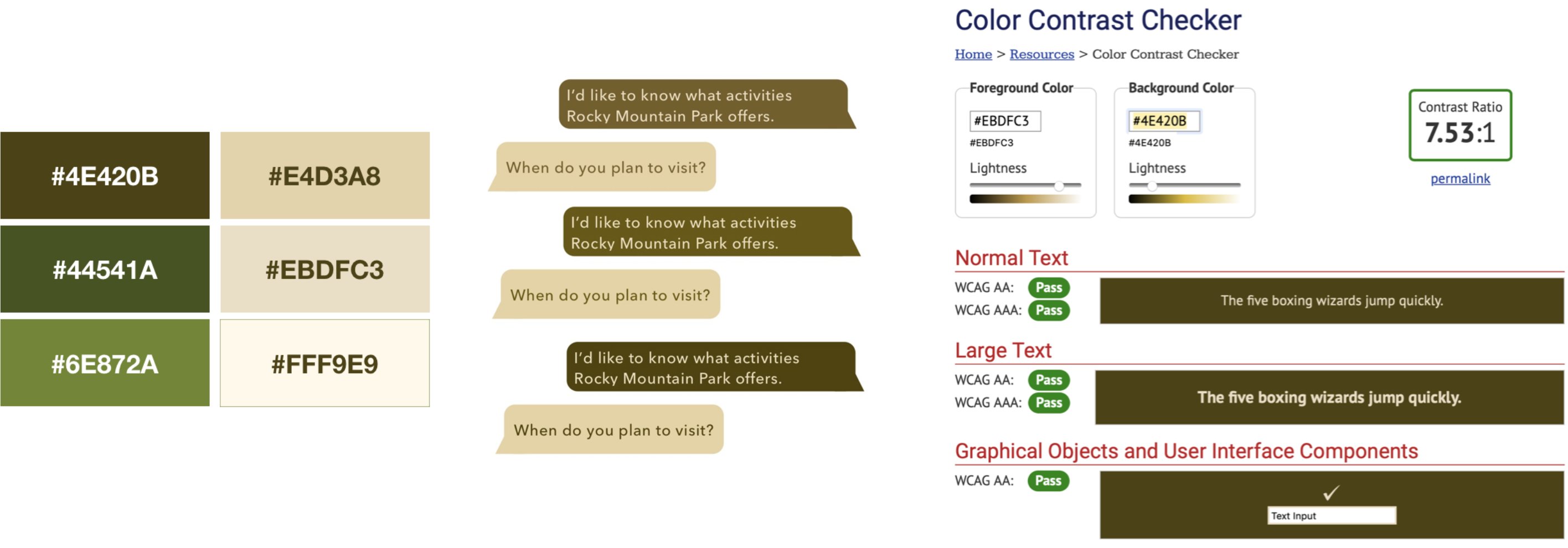
Phase 5: Hi-Fi PrototypeAfter receiving comments from the Mid-Fi usability testing, we iterated the design to included changes we observed from the users. We also added color that reflected nature and National Parks. All of the colors were checked to confirm that their contrast passed the Web Content Accessibility Guidelines (WCAG) with AAA. |
|||||
 |
|||||
|
|||||
Phase 6: Next StepsAs with all projects, we arrived at a place we were happy with and believed assisted users with planning a trip to the National Parks; however, there are always next steps. For our interaction bot the next steps we would take are:
|
|||||
| Home Emotion Slider PeopleJoy MTA Subway | |||||