 |
|||||
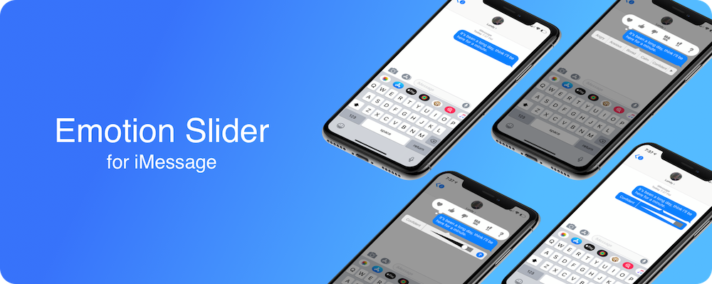
Add an Emotion to your iMessage and Don't be Misunderstood |
|||||
|
|||||
Challenge:The immersive programs at General Assembly requires long working hours on campus. Sometimes late at night and on weekends. At times, this can result in a lack of communication between friends and family for students. GA has asked me to explore and discover a solution that will support the student experience.Goal:Understanding the user in order to redesign one type of communication (i.e. video chat, text messaging, sharing photos) within an existing mobile app (i.e Twitter, Instagram, Facebook, iMessage).Phase 1: Research & SynthesizingSince I was conducting user interviews on the General Assembly campus, no screener survey was necessary since all the people I interacted with were immerse students. Knowing I had the intended users, I created a discussion guide. Some of the questions included:
|
|||||
 |
|||||
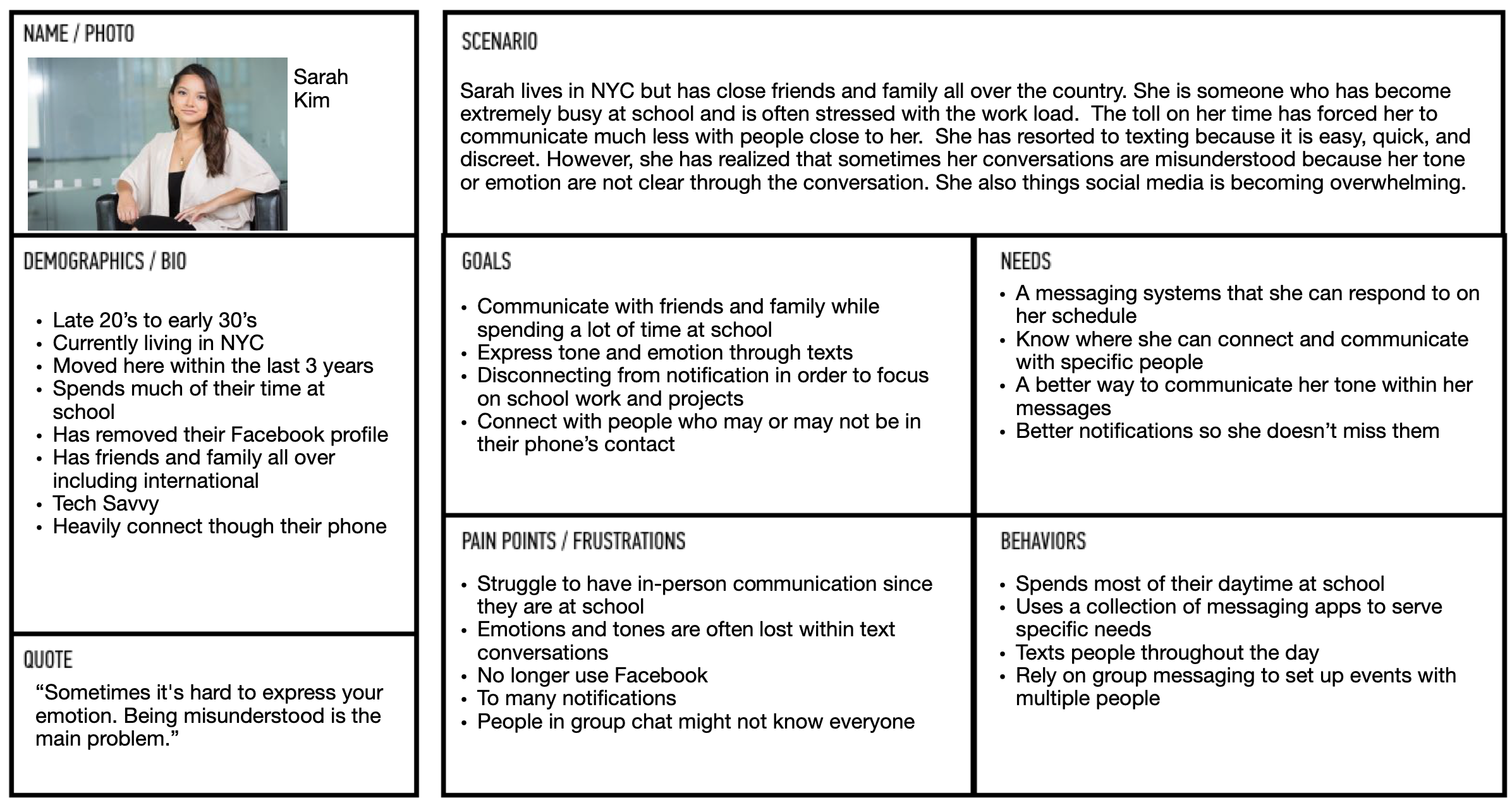
| With affinity mapping complete, I saw that users felt they were often misunderstood because their emotion or tone was not conveyed in their texts. Normally, users made up for this with other forms of communication (ie. In person, on the phone) which was not longer accruing because of the time they were spending working on campus. Users also tended to only text because they didn't have time to juggle conversation on multiple platforms and felt texting was the most fundamental form of communication. This information led to the making of our persona: Sarah Kim. | |||||
 |
|||||
Using the persona and all additional information I gathered from the user interviews, I created the following problem statement:
When students become busy, they dramatically scale back their level of communication. Phase 2: Ideate & Proposed SolutionTo start solving the user's problem, a few ideas that would work were quickly drawn out. I took five minutes to come up with as many ideas as possible that would solve the problem statement. |
|||||
 |
|||||
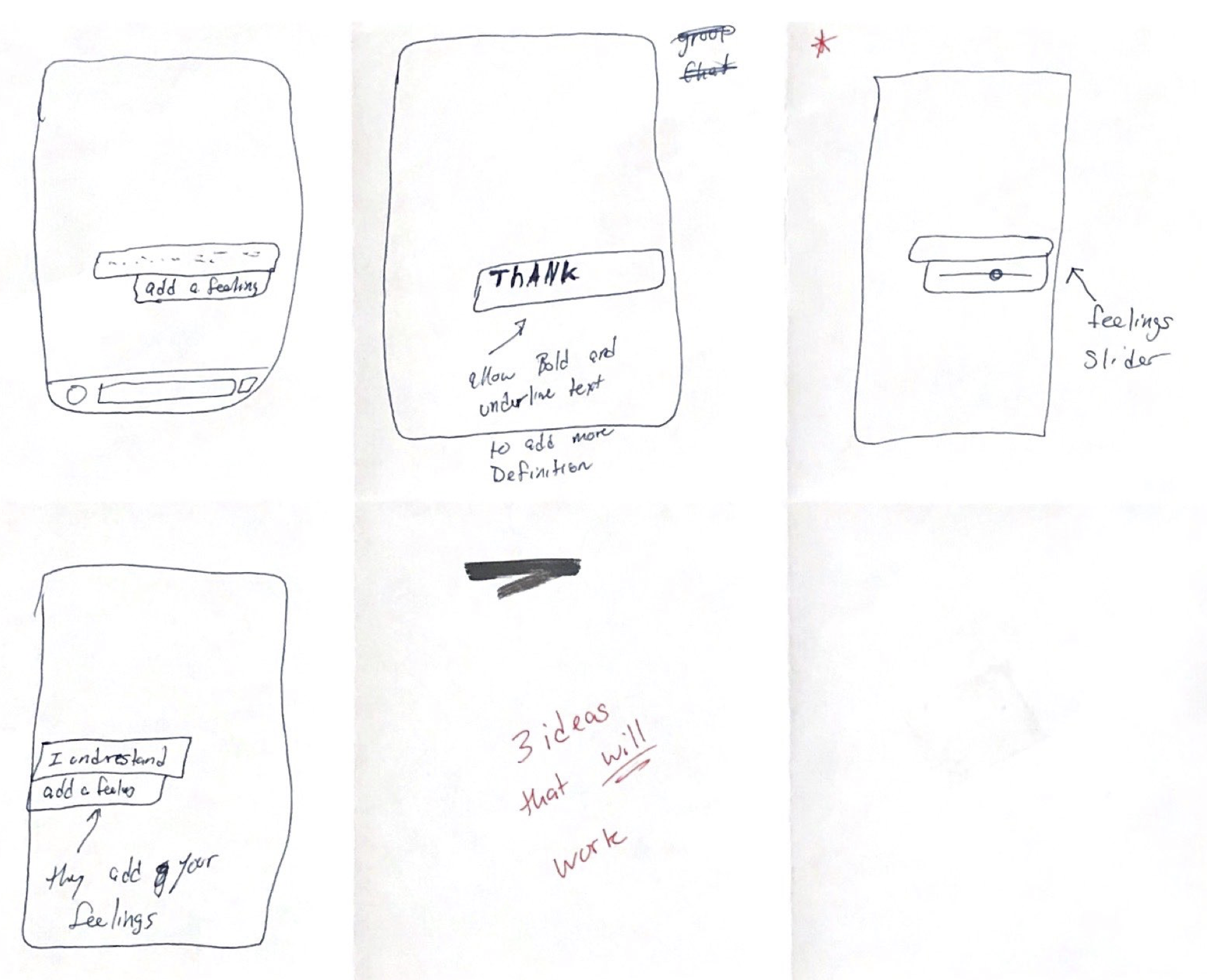
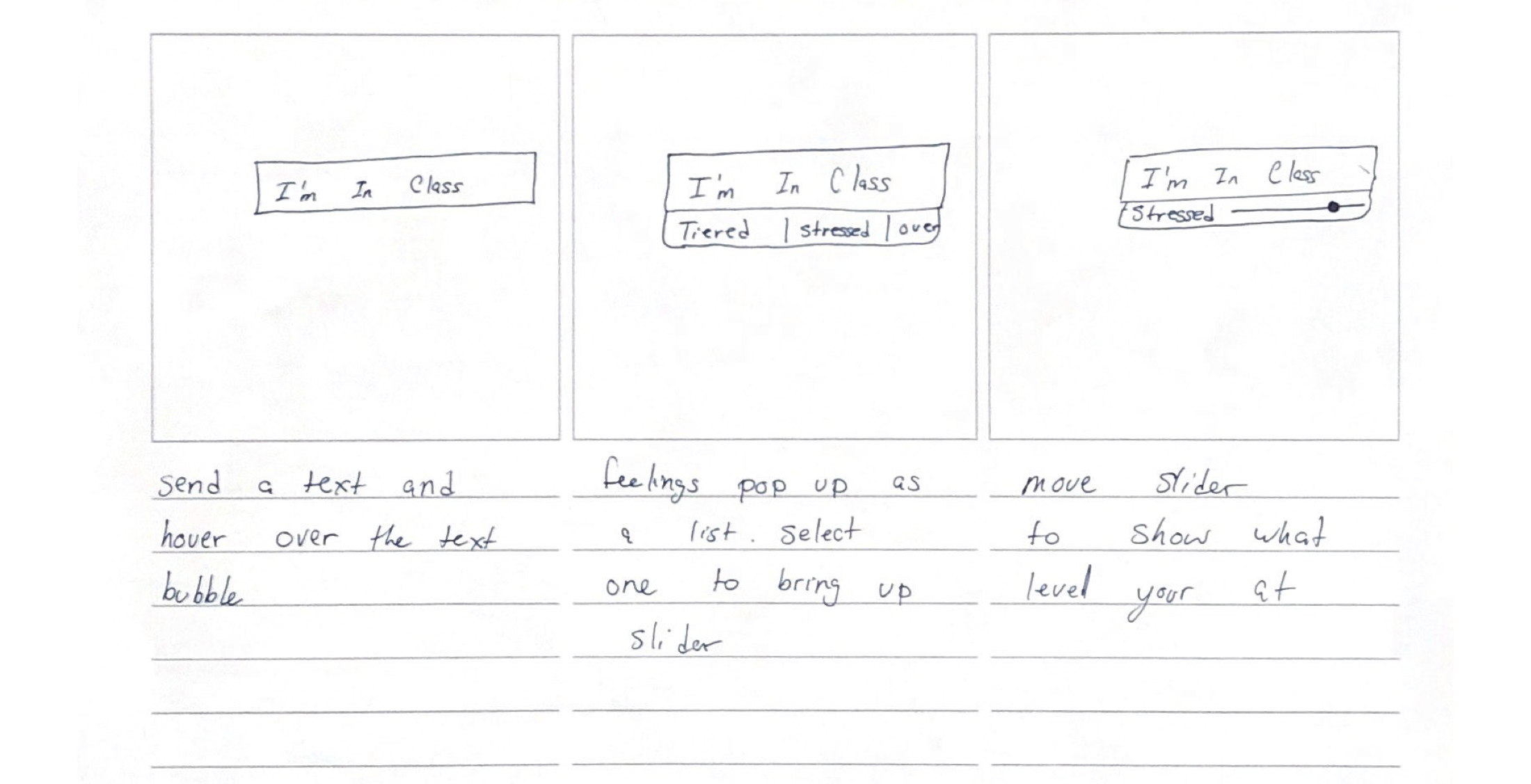
| Sketches From Brainstorming | |||||
Using the quick sketches, I determined that the slider would be the simplest, most effective method to convey the user's emotion/tone based off of user response from testing. Next, I began to think about the entire process a user would take to complete the task of adding an emotion. A storyboard was created to think about the screens needed for the task. |
|||||
 |
|||||
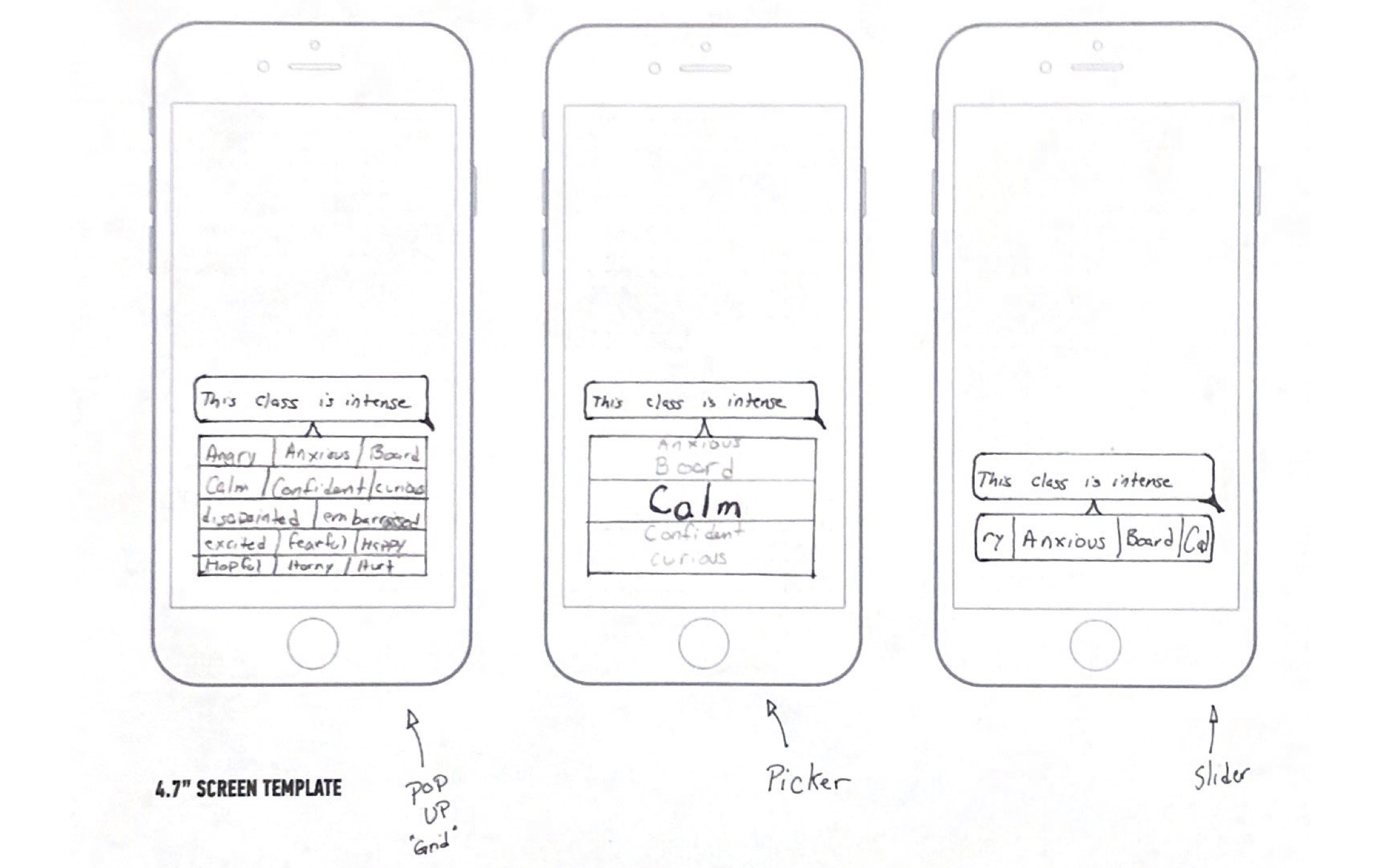
| Storyboard: Steps in a Process | |||||
|
The storyboard determined that two screens were necessary, one for selecting the emotion and one for determining the intensity. Once the flow and necessary screens were determined, several designs for the emotion selector were created. The final design for the selector was a horizontal carousel that uses Apple's "Edit Menu" from their Human Interface Guidelines. |
|||||
 |
|||||
| Three Sketches for the Emotion Selector | |||||
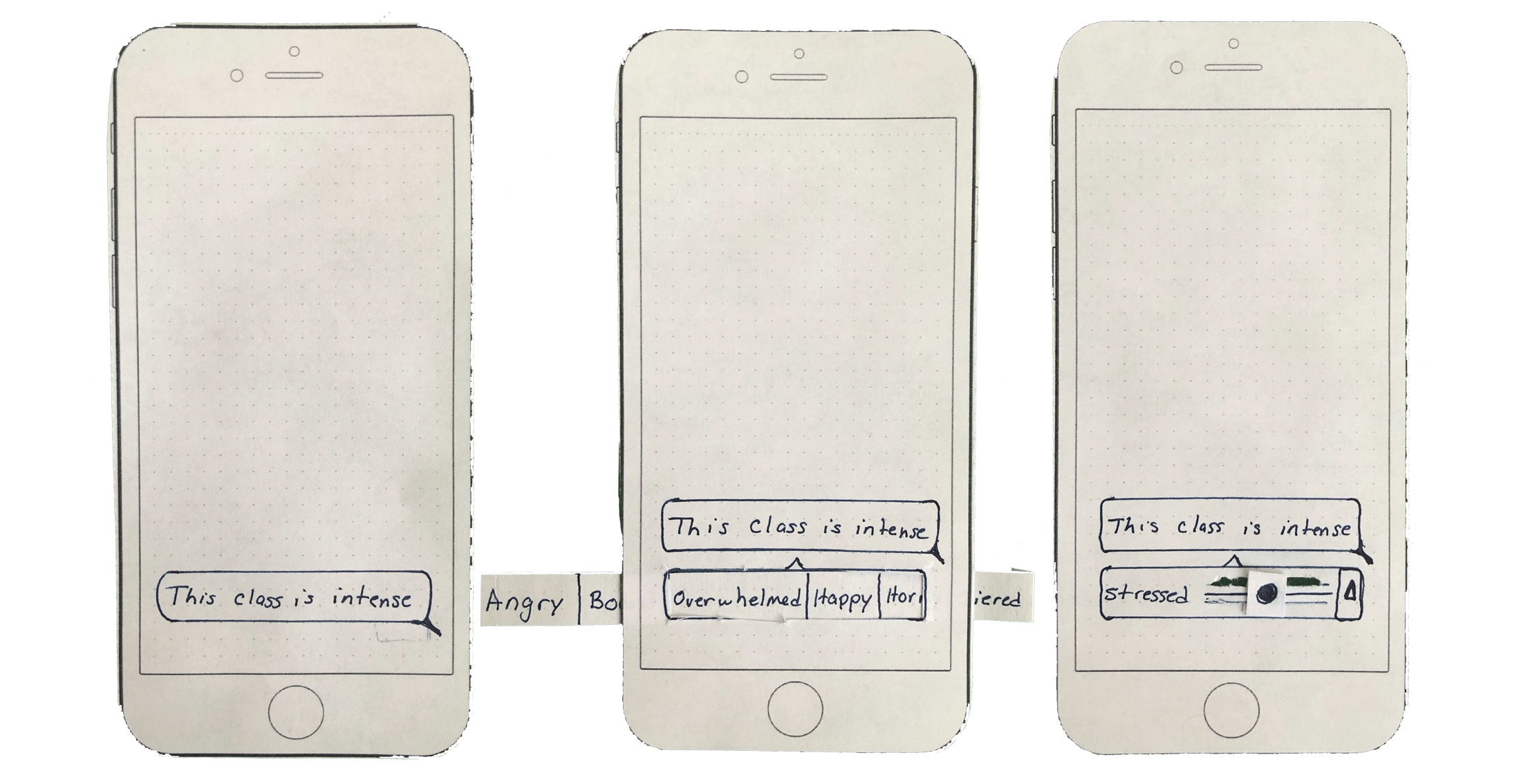
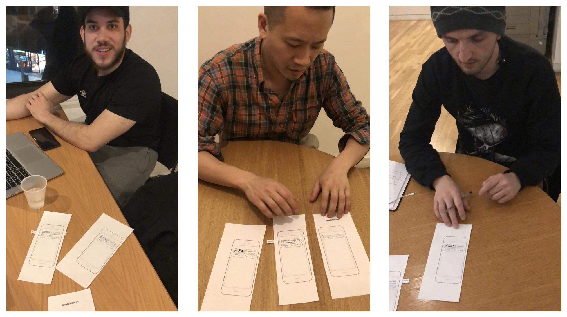
Phase 3: Lo-Fi Paper Prototype, First Round Usability Testing, & IterationTo allow quick iterations, I constructed a paper prototype to save time by testing quickly. Three screens were created to test the user's ability to complete the task of adding an emotion to a text message. | |||||
| |||||
| Paper Prototype for First Round Usability Testing | |||||
 |
|||||
Four users were tested and the primary problem discovered was the user's misunderstanding of the slider determining the intensity of the emotion.
"The slider changes the intensity; however, I don't know if sliding it to the right is more." User 2 After completing a round of usability testing, I transitioned to Sketch and implemented the feedback from the users. |
|||||
 |
|||||
| Mid-Fi Prototype Incorporating User Feedback | |||||
|
The major change from the paper prototype was the slider. Responding to user feedback, the horizontal slider didn't provide enough feedback to users. The first idea was to use color to display the intensity. However, with some users potentially having difficulty deciphering and seeing the colors, I settled on a triangle to visually indicate the intensity. |
|||||
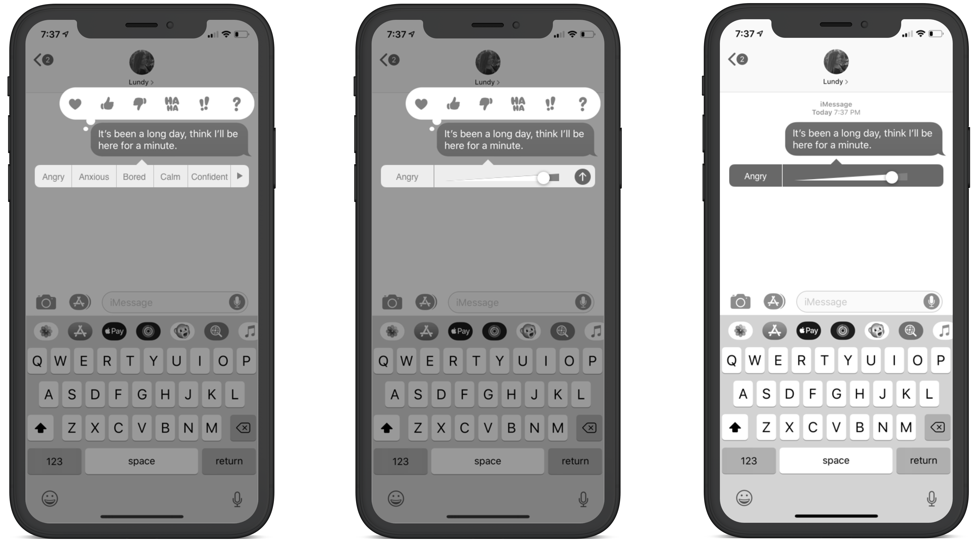
Phase 4: Mid-fi Usability Testing, & ReportWith the Mid-Fi prototype complete, usability tests needed to be conducted to confirm the changes made benefitted the users. One medium issues was discovered as well as a success. The two reports are below: |
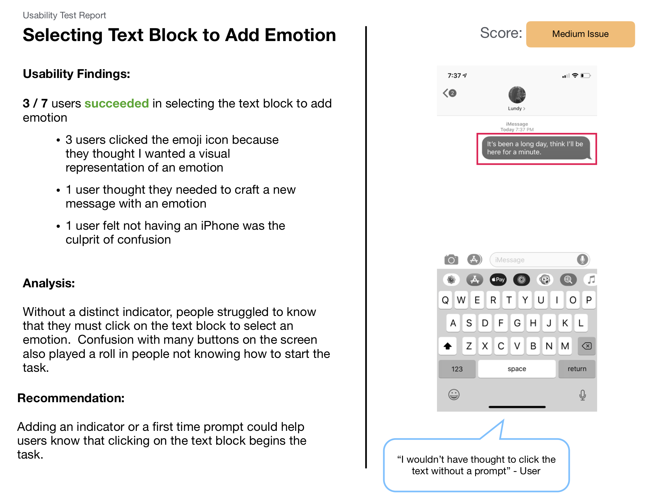 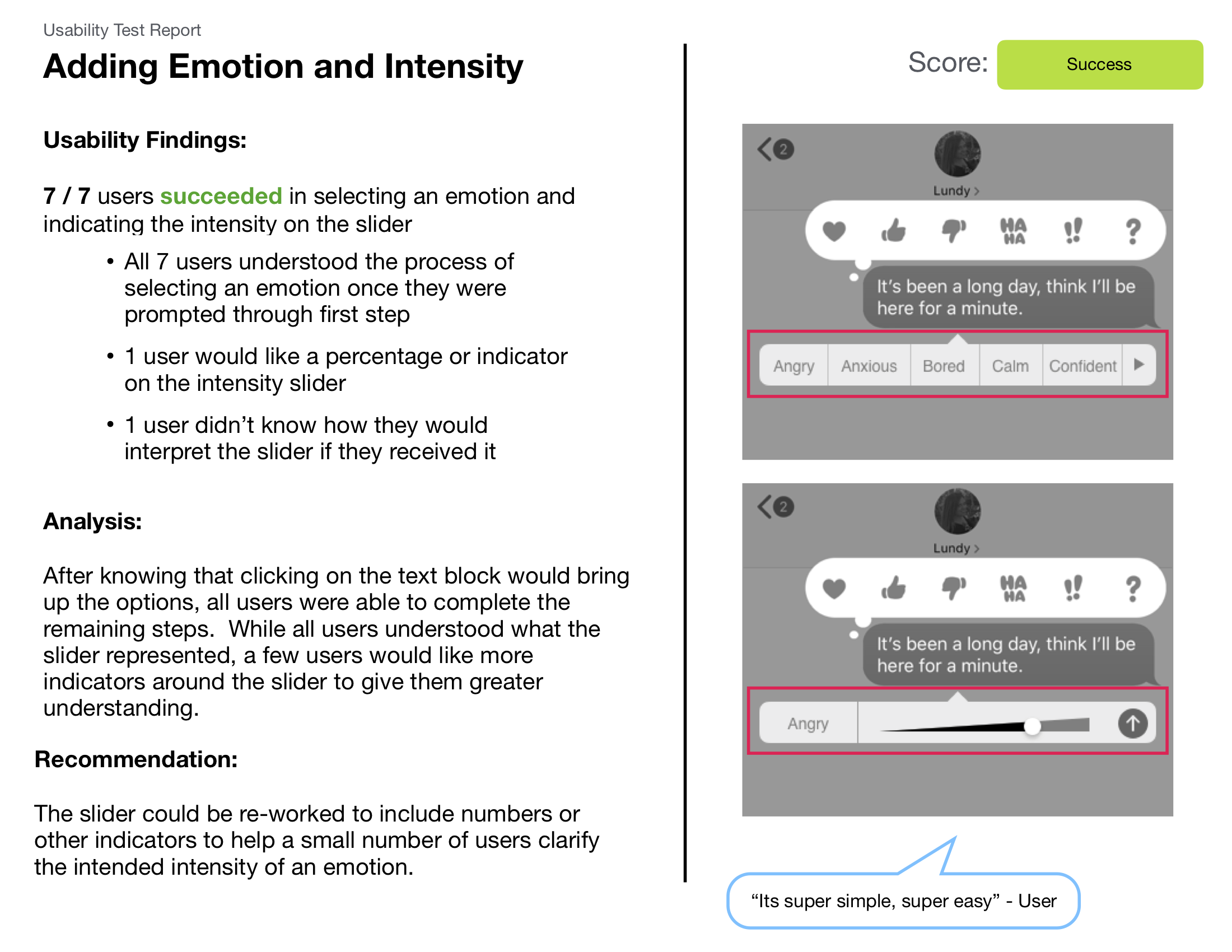 |
||||
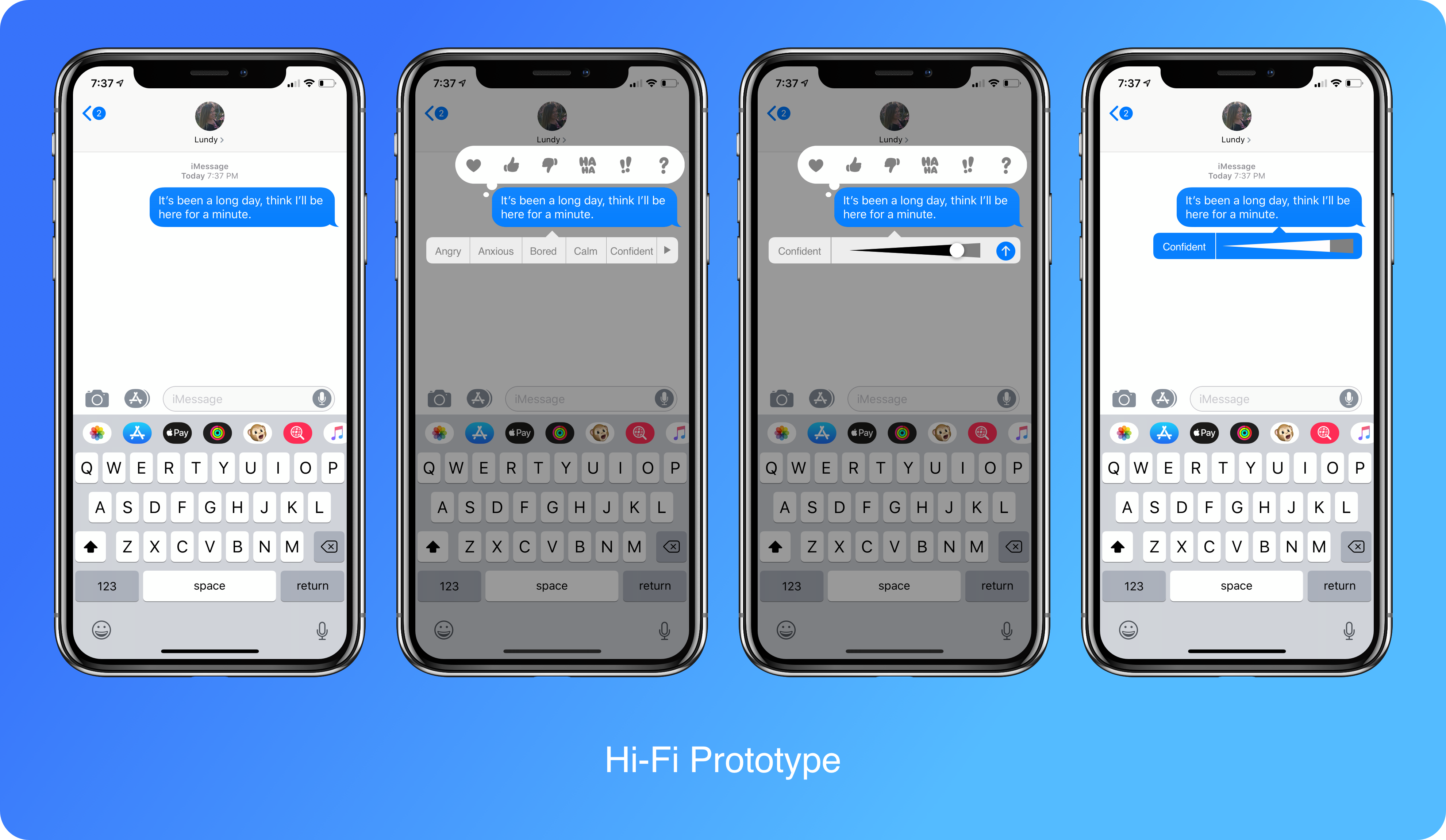
Phase 5: Hi-Fi Prototype |
|||||
|
|||||
Phase 6: Next StepsNow that the concept is near complete, figuring out how to deploy this feature integration would be a logical next step. Exploring iMessage plugins would be one way of making this a reality. While it would require the original idea to change a little; it may be the only way of accomplishing this idea because of Apple's strict rules.Also, building out an onboarding section would be very effective because users still had difficulty starting the task as shown in the usability report. This might seem like it should come before figuring out deployment; however, the onboarding design may change depend on deployment. |
|||||
| Home PeopleJoy Ranger Bot MTA Subway | |||||